


Last month, we talked about how you can personalize your online home with a custom domain. Another way to customize your site? Colors. Bold, rich, bright colors. And you’re in luck! With a Custom Design upgrade, you can select the colors for your site, from ready-made color palettes to your own handpicked combinations.
To get a feel for how you can update your site’s color scheme, let’s take a look at a few blogs on WordPress.com using Custom Colors:
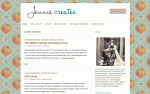
Jennie Creates
Jennie Creates
How did you decide on this color palette and background image for Jennie Creates? I chose this particular palette because the combination of red and teal is pleasing to the eye, and with the punch of orange, it’s even better. The cream color serves as a nice buffer against the bold colors, and brown is a great color choice for text. Black is boring and blue feels sterile, but brown is warm, sharp, and still readable. My background pattern gives me a desired “stained glass” effect. It’s busy, but not distracting, which is just what I wanted to complement the white space.
If you aren’t able to paint the walls of your home in your favorite colors, at least put those colors on your blog. I’d encourage any serious blogger to customize her blog to fit her personality. It reflects the mood of your blog, and the time of year or season of life you’re in. The Custom Colors feature guides you through recommended color options so you don’t wind up with shades that don’t match. You can go bold without going nuts.
Pixi Wishes and Forehead Kisses
Pixi Wishes and Forehead Kisses
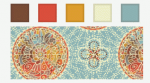
How did you decide on this color palette and background image for Pixi Wishes and Forehead Kisses? The inspiration behind my color scheme came from a photograph from a fashion shoot in a magazine, where the photographer used pink smoke bombs. I played around with watercolor and smoke brushes in Photoshop to find the shades of pink I liked, which became the foundation for my custom header. Layering the brush imprints created darker and lighter areas, so I used the eyedropper tool to extract some of the darker shades and created mock palettes from which I chose the shade for my social media icons. I pair these shades of pink with black text — which make my titles and headings visible — and a white background, which prevents the overall design from being distracting and allows my posts to be the focus.
Find inspiration from designs you love, whether on blogs, photographs, illustrations, or book and magazine layouts. Create mock color palettes and don’t be afraid to try various color schemes, patterns, and layouts. If you don’t like something, WordPress allows you to change it easily.
Don’t have too specific of an idea of how you want things to look, as great ideas often come from tangents.
Nishita’s Rants and Raves
Nishita’s Rants and Raves
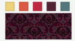
How did you decide on this color palette and background image for Nishita’s Rants and Raves? I did a couple of trials with other custom color and background options before I decided on this current look. I am bad at coordinating colors, but the Custom Colors feature allowed me to choose from a palette of colors. Once I chose this palette, I saw and fell in love with a purplish background that appeared as an option. I love the rich color and detail in my pattern.
The Custom Design package, which includes Custom Colors, is worth the upgrade. It’s cool to tweak your blog to look just the way you want. The Custom Colors feature is easy and intuitive: you change the colors, then preview. If you don’t like it, you change it again. It’s great for non-designers. I could tweak the CSS to make these changes — which is also part of the Custom Design upgrade — but that’s more cumbersome for me. So, the Custom Colors feature makes this aspect of customization easy.
I’ve noticed not all themes work as well with this feature, such as more ”fixed-look” themes like Something Fishy, The Great Adventure, or A Simpler Time. Also, patterned backgrounds don’t suit themes that “absorb the background” in the post text (such as Coraline). In my opinion, solid, white, or black backgrounds work best for these.
Preview Colors on Your SiteWant to try the Custom Colors feature? You can preview colors, right in your dashboard, before purchasing the Custom Design upgrade:
- Go to Appearance → Themes.
- Click the Customize button for your current theme or Live Preview for another theme.
- Launch the Customizer by hovering over the black bar on the right, then click on Colors & Backgrounds.
For more details, visit our Custom Colors support page, Custom Design support page, and the CSS Customization Forum. Or, if you’re ready to add splashes of color to your site, visit the Custom Design upgrade page.
We’ll continue to highlight more upgrades in the WordPress.com Store, so stay tuned.

